https://www.firstclassdschool.com

5 issues about the website:
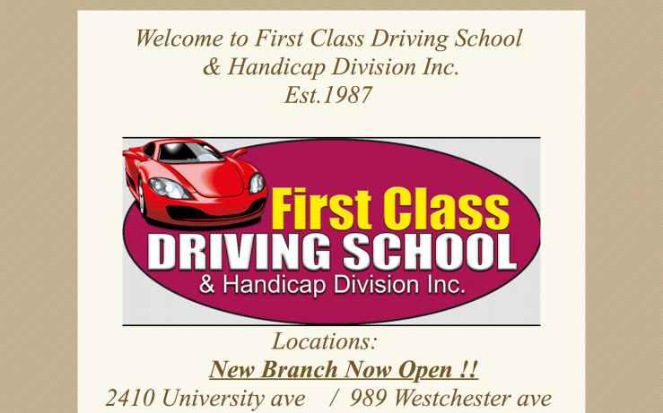
- The structure of the website is very unclear. First impression is that the logo and the phrase “New Brach Now Open !!” are clickable, but they actually not. The user has to scroll down to find the option menu which should be the first thing the user sees.
- There too many different fonts of different sizes. Also, there are not shortcuts which provide more information. For example, instead the addresses take the user to Google Maps, they don’t take you anywhere. It is a lot work for the user to copy and paste to know where the driving school is located at.
- The fonts have too many vibrant colors like red, yellow, and blue which are very distracting.
- There is no organization of the information. Some paragraphs are way bigger than others, and do not follow hierarchy order. The logo is cut off in the right side, and some paragraph are not centered. They look tilted.
- Color scheme is not attractive or interesting. It does not serve any purpose. Finally, the video at the bottom does not work, and everything on a website should make the life of the user simpler.
Penelope Almonte